Making Photos POP
4/30/10
-These are all photos I took and edited them to make the more vibrant, colorful, and more interesting.
This will be a before and after kind of deal.
Blur overlay
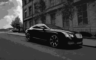
This is the photo before anything was applied to it. I took like outside after it rained. As you can see the car has a shadow in the small puddle. I like how this photo almost looks like a real car. This is the original photo.
This is the picture after the blur overlay took place. I really like how the colors pop in this photo. I also like the contrast with the car, the tin, and the grass in the background.
This is the photo taken of the sunset on fowler lake. This is the before picture.

This is the photo after the blur overlay took place. I really like this photo just because the colors. They are so dramatic! I also like the contrast with the houses and trees in the background.
Filter in the background!
This is the photo before anything was applied to it. I took this right before it started raining so the lighting is cloudy-ish. I like how crisp the clock is against that neutral background.
This is the picture after the filter was applied in the background. As you can see the clock looks like same but the background got changed dramitcally. I chose the water filter in the background because it was just about to rain when i took this. I also chose the light color for contrast.
This is the picture before anything was applied to it. I was under incandescent lighting and tried to get the shadow effect which i think worked. This is the before picture.
This is the photo after i applied the glowing filter in the background. The main object of the photo again, is still normal and in focus, while the background became extremely dark. I chose this background because i feel like contrast adds alot of balance in digital photography.
Neon glow filter

This is a picture of the badge on the back of my car. This is the before picture.

This is the picture after i got done editing it. I first of all cropped the photo to focus more on the badge. The filter was the neon glow filter. I chose the color to be a orangey, kind of like the color of my car. I then put a layer setting called difference on. This made the photo look almost negative with the contrasting teal color.. I reall like the way this came out.

This is a photo I took of a sunset on Mcmahon road. This is the before picture.

This is the photo after i got done editing it. As you can see the colors are very dramatic and pop extremely well. With this photo i did the neon glow filter with a reddish background. I then put the layer setting as color burn. This made the reds and oranges pop agains the back background so well.
Easy blur filter

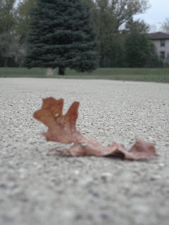
This a photo of a leaf that was in my driveway. I took it up close to keep the leaf more in focus as well as the main attention grabber. This is the original photo
 This is the photo after the easy blur filter was put on. The ground right in front is a little bit more out of focus. The trees in the background are also softer and have less detail. I also made thecolor more intense as well as darkened the picture a bit.

This photo is of my friend katie looking out onto the sunset. I took this with katie on the right side more to satisfy the rule of thirds. This is the before picture

This is the photo after i put the easy blur feature on. As you can see katie has softer edges which makes the photo more blendable. I also brighten the photo and made the saturation higher to help the colors pop.
 This is the first photo i did for my summative assessment. I chose to do a cool man look with this picture. Thats why i have the sunglasses on! I chose black and white because i think it makes the picture look more sharp.
 This is the second photo i chose to do for my summative portraits. I chose to have an action shot of me diving in the water because I LOVE WATER. Swimming, boating, skiing, you name it I LOVE IT. I thought that would be a good photo representing me. I altered the saturation and did a color balance to the photo.


 This photo i also took at memorial park Oconomowoc. I chose to take this picture because of the overall layout. I think this photo turned out well. Really gives you the urban feel.

 This is the photo i chose for the yellow wallpaper assignment. The storys main role was talking about depression. They also talked about the main charactor being locked in a room alone with nothing to do. I tries to tie in the depression aspect of the photo with the moms face and posture. I told her to sit in the corner! I think this photo shows depression very well. She looks so bored. She also almost looks like she starting to go insane! I used the blur overlay, black and white filter with a warm sepia filter as well. I also made the photo alittle lighter because it was so dark before.


 This is the photo after the blur overlay took place. I really like this photo just because the colors. They are so dramatic! I also like the contrast with the houses and trees in the background.


 This is the picture after i got done editing it. I first of all cropped the photo to focus more on the badge. The filter was the neon glow filter. I chose the color to be a orangey, kind of like the color of my car. I then put a layer setting called difference on. This made the photo look almost negative with the contrasting teal color.. I reall like the way this came out.
 This is a photo I took of a sunset on Mcmahon road. This is the before picture.
 This is the photo after i got done editing it. As you can see the colors are very dramatic and pop extremely well. With this photo i did the neon glow filter with a reddish background. I then put the layer setting as color burn. This made the reds and oranges pop agains the back background so well.
 This is the photo after the easy blur filter was put on. The ground right in front is a little bit more out of focus. The trees in the background are also softer and have less detail. I also made thecolor more intense as well as darkened the picture a bit.


